FM
—
UX/UI Design for Enterprise Platform Rebrand
FM Global — UI/UX Design for Enterprise Platform Rebrand
FM Global is a leading commercial property insurer serving a global client base. Known for its engineering-driven approach, FM specializes in helping clients mitigate the risk of natural disasters through proactive infrastructure strategies.
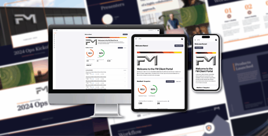
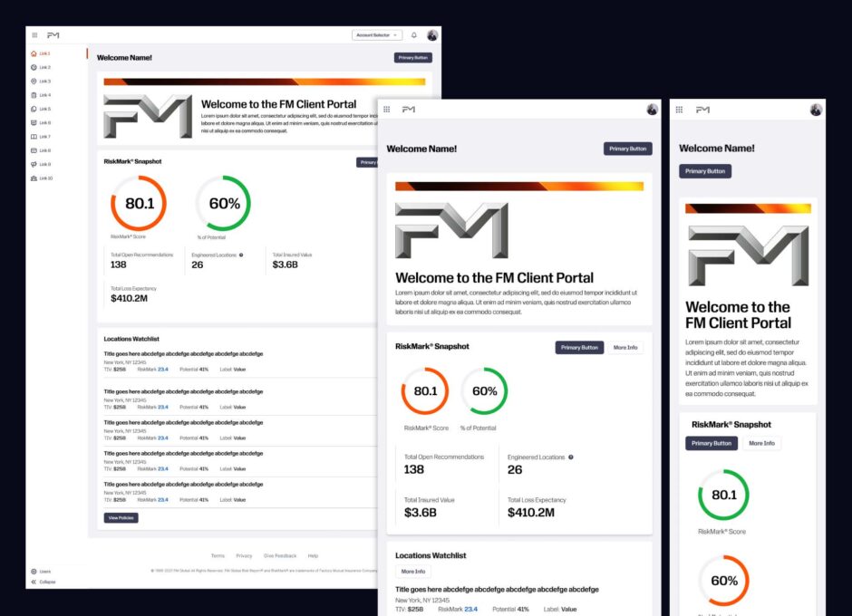
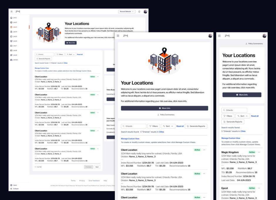
As part of a company-wide rebrand initiative, I was brought on as a UI/UX designer to support the transformation of Global Portal, FM’s primary client-facing platform. My work focused on modernizing the platform’s interface and aligning it with the updated brand system—ensuring a seamless, cohesive experience for FM’s enterprise users. Our team was working with a style guide provided by the design agency Prophet, pulling colors and fonts, look and feel and applying it to the CRM. We were not provided with explicit UI/UX direction, this was the creative strategy our team provided.
Key contributions included:
- Designing new branded components for Global Portal in line with the evolving visual language.
- Conducting a comprehensive heuristics evaluation of the existing platform, surfacing key usability issues such as inconsistent navigation patterns, unclear UI elements, and redundant layout structures.
- Identifying opportunities for vertical consolidation and improved content hierarchy to streamline user flows.
- Co-developing GP Vision 2.0, a refined design direction aimed at improving clarity, consistency, and visual alignment with the new brand.
- Creating a developer-ready style guide to support implementation, reduce design debt, and ensure consistency across future updates.
This work not only contributed to a more scalable design system but also created a clearer path for long-term UX improvements within the organization.
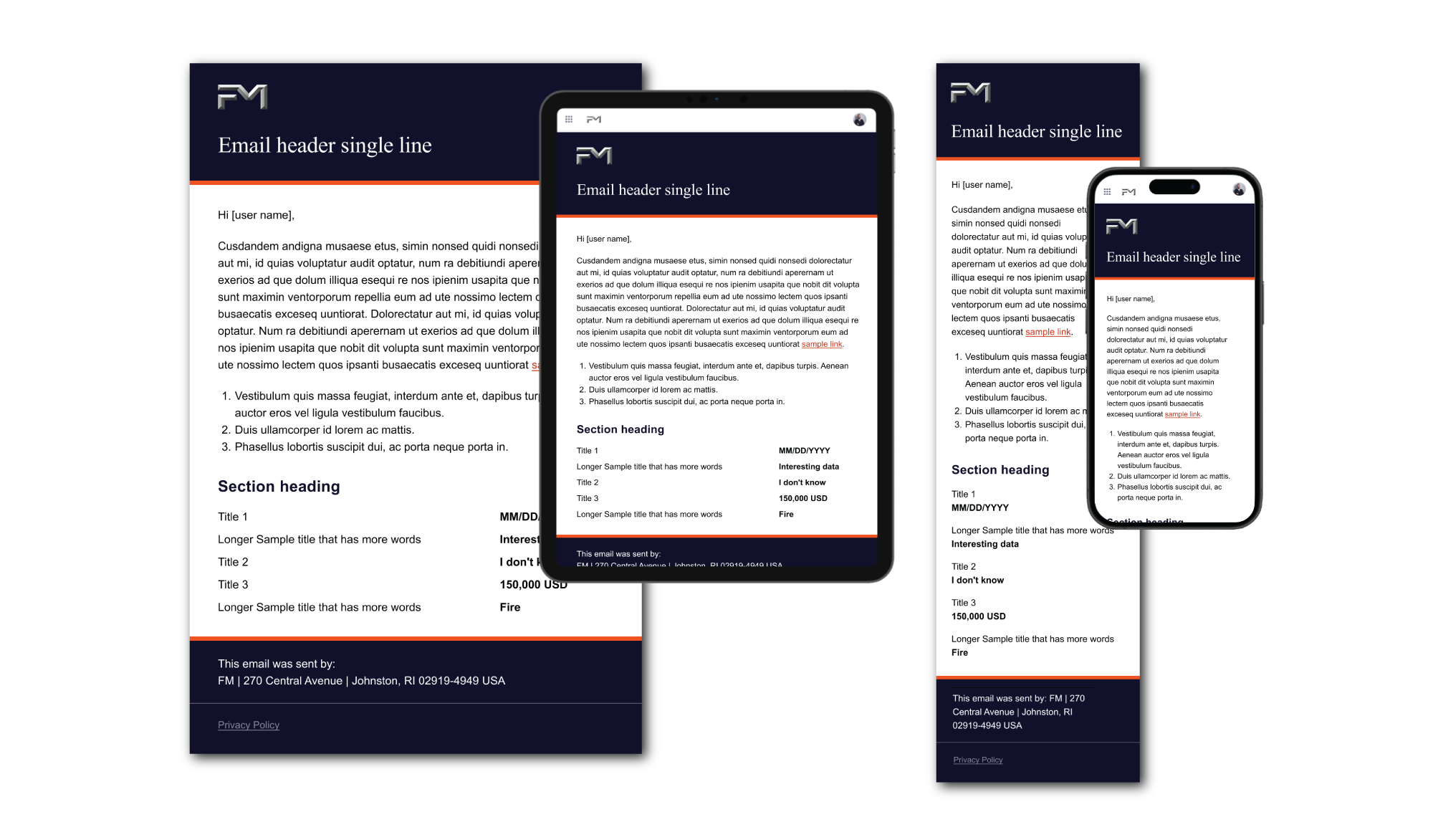
These are responsive email templates which I helped design in Figma, pulling colors and fonts, look and feel from the new FM branding style guide:
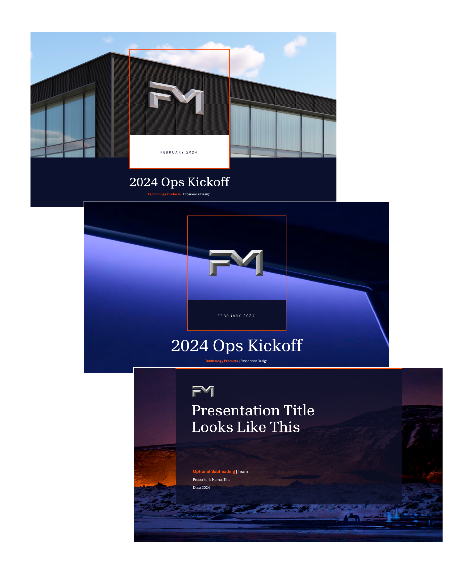
This is a library of icons that I helped to create for the rebrand. I created a Figma library where the iconography could live and be developed over time, and designed many of these icons.
The second image is of some of these icons applied, on the cover page for a presentation template.
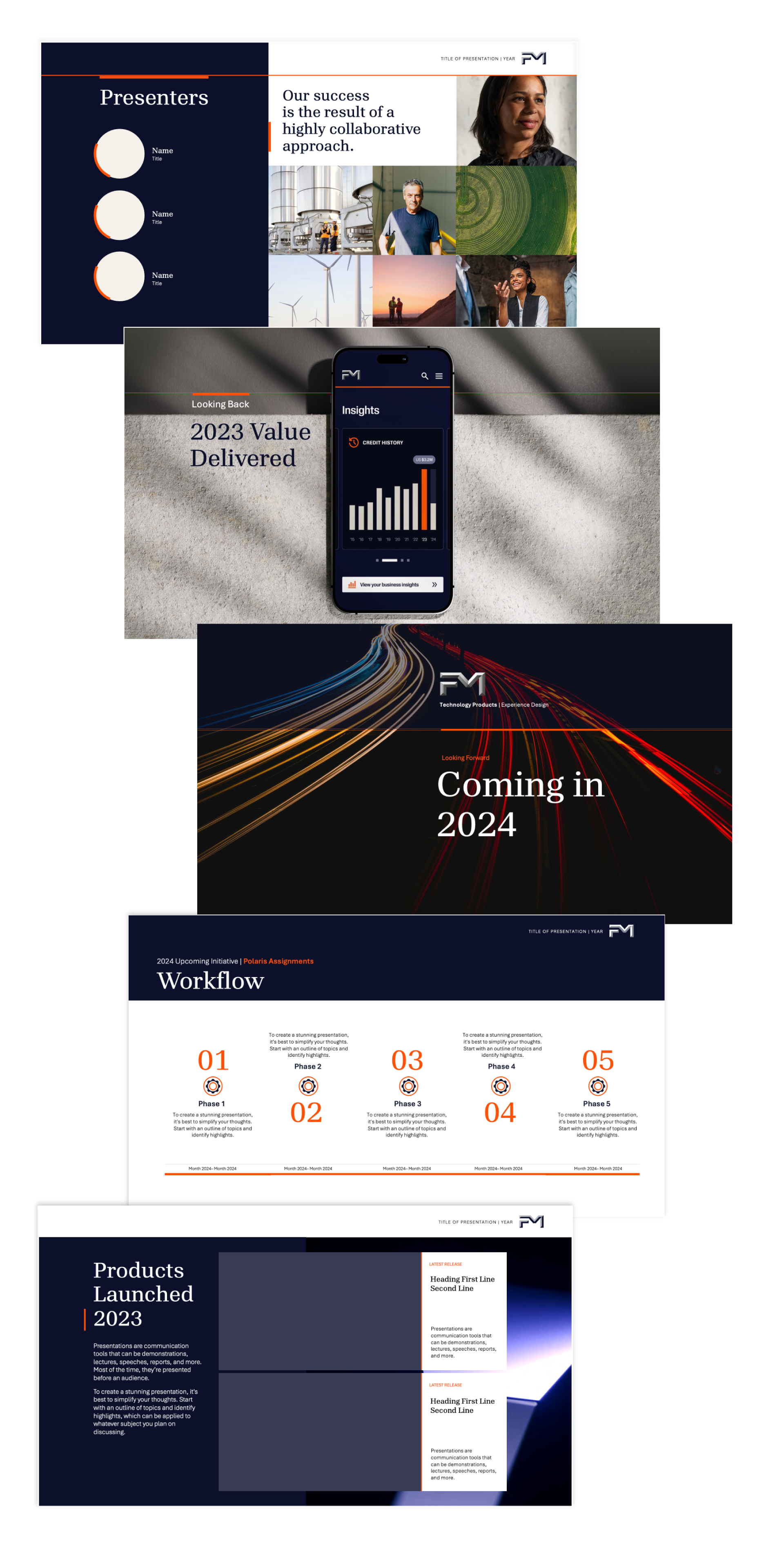
The following are sample slides from a template I developed in Powerpoint with the new branding, for internal company-wide presentations.
13 comments on “FM”
Comments are closed.