Chabot Space & Science Center
—
Visual Identity System for Community Fixture
As the designer for Chabot Space & Science Center—an educational nonprofit and regional science destination—I led a full institutional rebrand that revitalized the Center’s public image and significantly enhanced community engagement.
I oversaw the development of a cohesive visual identity, including a refreshed logo, new tagline, and a full redesign of ChabotSpace.org, resulting in an increase in web traffic and improved accessibility across devices. I built a scalable visual system applied across all touchpoints—campus maps, marketing collateral, interior and exterior signage, and exhibition graphics—helping to unify the visitor experience and streamline internal design workflows.
My work spanned both digital and print design for year-round programming, educational initiatives, and high-visibility events. This included branded content for campaigns, social media, and digital ads, along with materials for Chabot’s annual fundraising gala, which saw an increase in donations following the rebrand.
In collaboration with exhibit and education teams, I developed visual narratives for both permanent and seasonal installations—designing infographics, interactive signage, and environmental graphics tailored to diverse age groups. Following the rebrand, visitor attendance increased, supported by a stronger visual presence and clearer messaging across all channels.
This holistic design effort helped re-establish Chabot as a modern, mission-driven institution while laying the groundwork for scalable design standards across departments.
Redesign of Chabot’s Logo
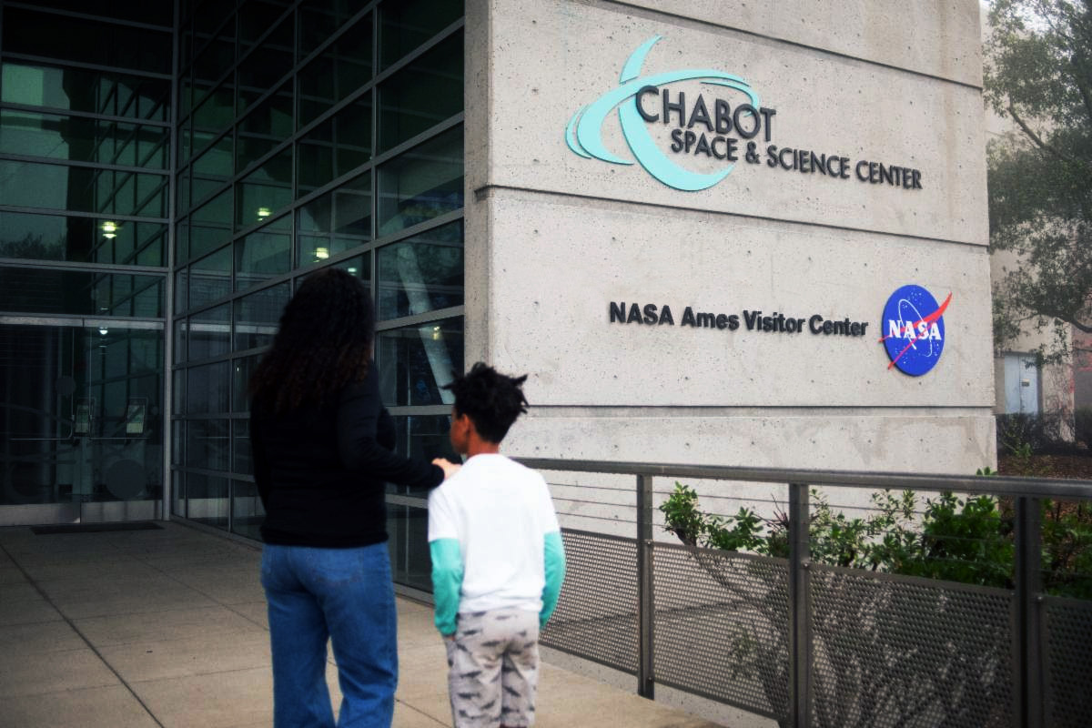
The Ask: I recognized the need to redesign Chabot’s logo immediately upon arriving at the museum. The existing logo was problematic. Primarily the combination of fonts, the dark blue and black, and the floating Saturn made it difficult to apply to a range of materials, and it felt stylistically stale and inaccessible. I proposed to the marketing team that I come up with a new logo and font for use throughout the museum, and the team enthusiastically agreed.
The Solution: I created a bright ‘Chablue’ blue/teal gradient, which I felt had dynamism and was uplifting, engaging, and fun. I integrated the Saturn icon with the type for a tighter, more cohesive feel. I proposed the font Futura be used for the logo and throughout Chabot’s materials; the geometric sans serif feels appropriate to the world of science and technology. I then presented these materials to the Board of Directors and the internal departments for approval, with examples demonstrating the logo on various print and digital materials, clothing and exhibit signage. It was met with enthusiasm.

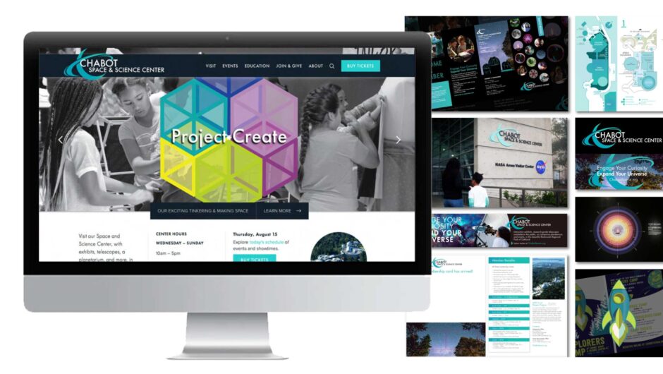
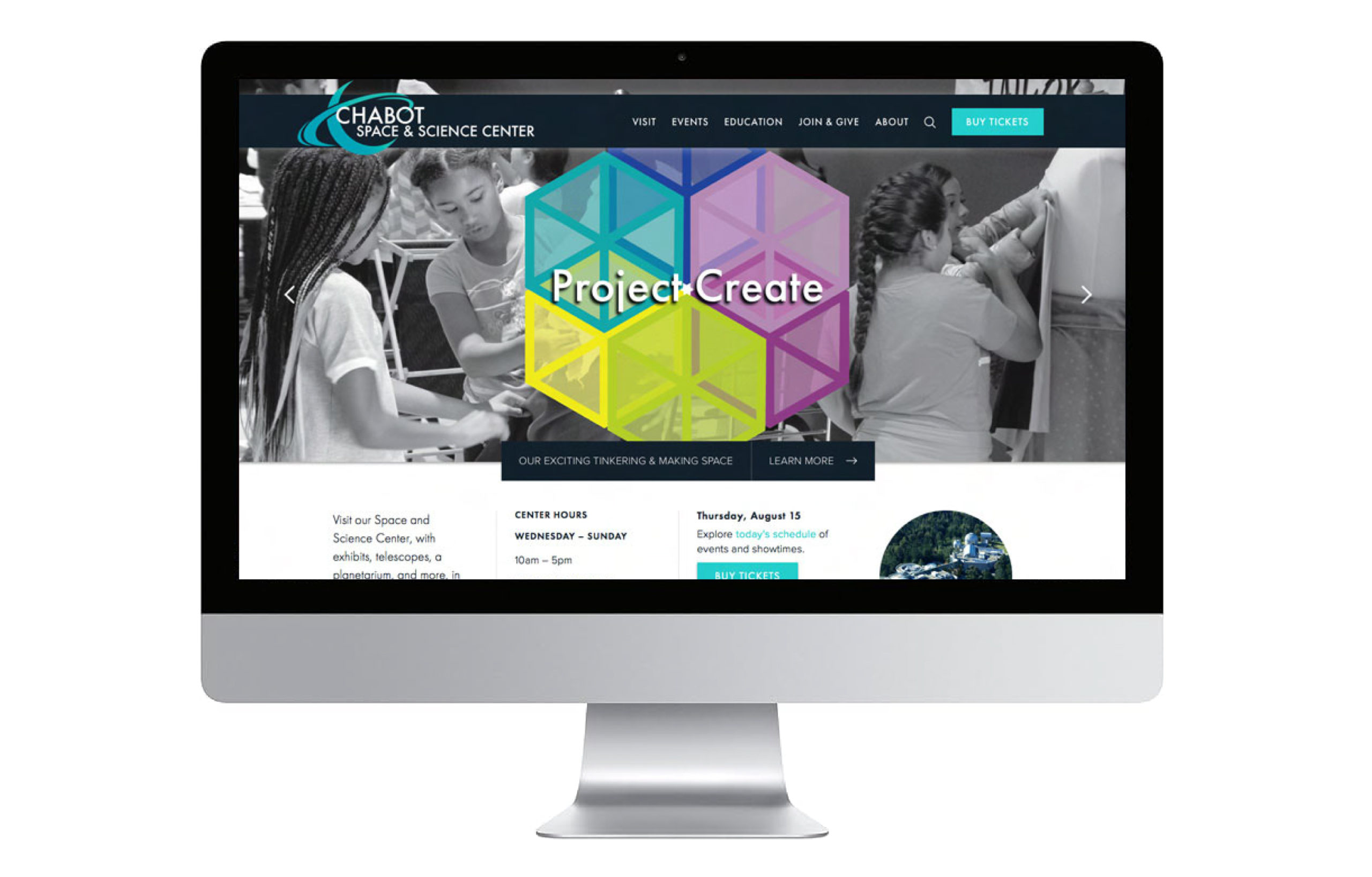
WordPress Site
The Ask: The need for a new website for Chabot was recognized by all. The previous site was difficult to navigate, stylistically dated, and there was no way to effectively represent current and upcoming events.
The Solution: I managed the design and implementation of Chabot’s new WordPress Site, chabotspace.org in collaboration with Chabot’s marketing team. Please note that I have not been responsible for the management of this site since 2020. I researched other museum sites as precedents for common successful sites within the industry, as well as for examples of what we’d like to avoid. Using this research, discussing needs with the various internal teams, and mapping heuristics of the existing content, I came up with a structure for the site. I helped in the search for a web development team to help build the site in WordPress, and landed on the firm Hyperarts. I worked closely with their team, managing the effort. I created wireframes for the site, and designed all original banners, graphics, and rotors.
The Success: The site was launched in 2018, and received a positive responsive from all. The site is now better able to convey the dynamism of the Center, and the breadth of events that are hosted at Chabot. Attendance at events increased. Six years later, the site has proven adaptable to all the needs of the museum.
Chabot’s Home Page when it was first launched in 2018:
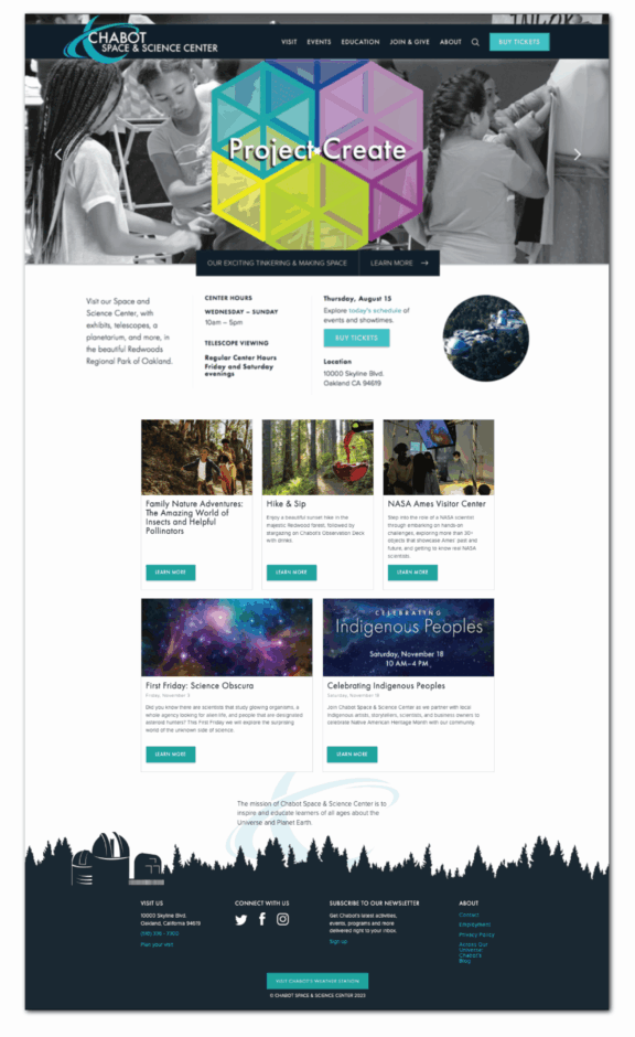
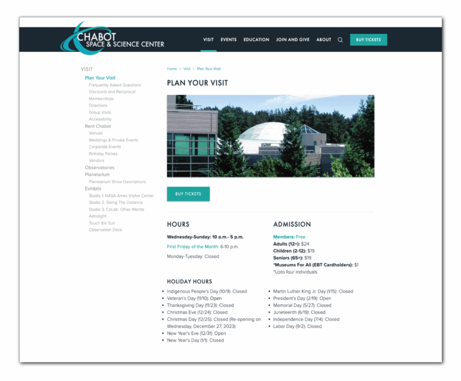
This is the Plan Your Visit page of the site, which demonstrates the structure of the interior pages—the side navigation in list format, the side and top navigation when a page is selected, the teal text indicating links, the teal buttons for Buy Tickets, and the banner format at the top of each page. I found the side-navigation list format to be the most effective format for communicating the extent of content, and commonly used for sites such as large museums with many pages. This allowed the top navigation to be fairly simple, making it easier for users to find what they’re looking for.
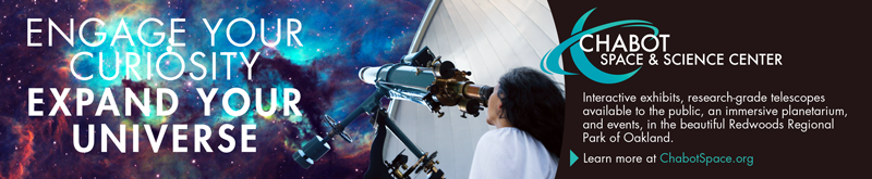
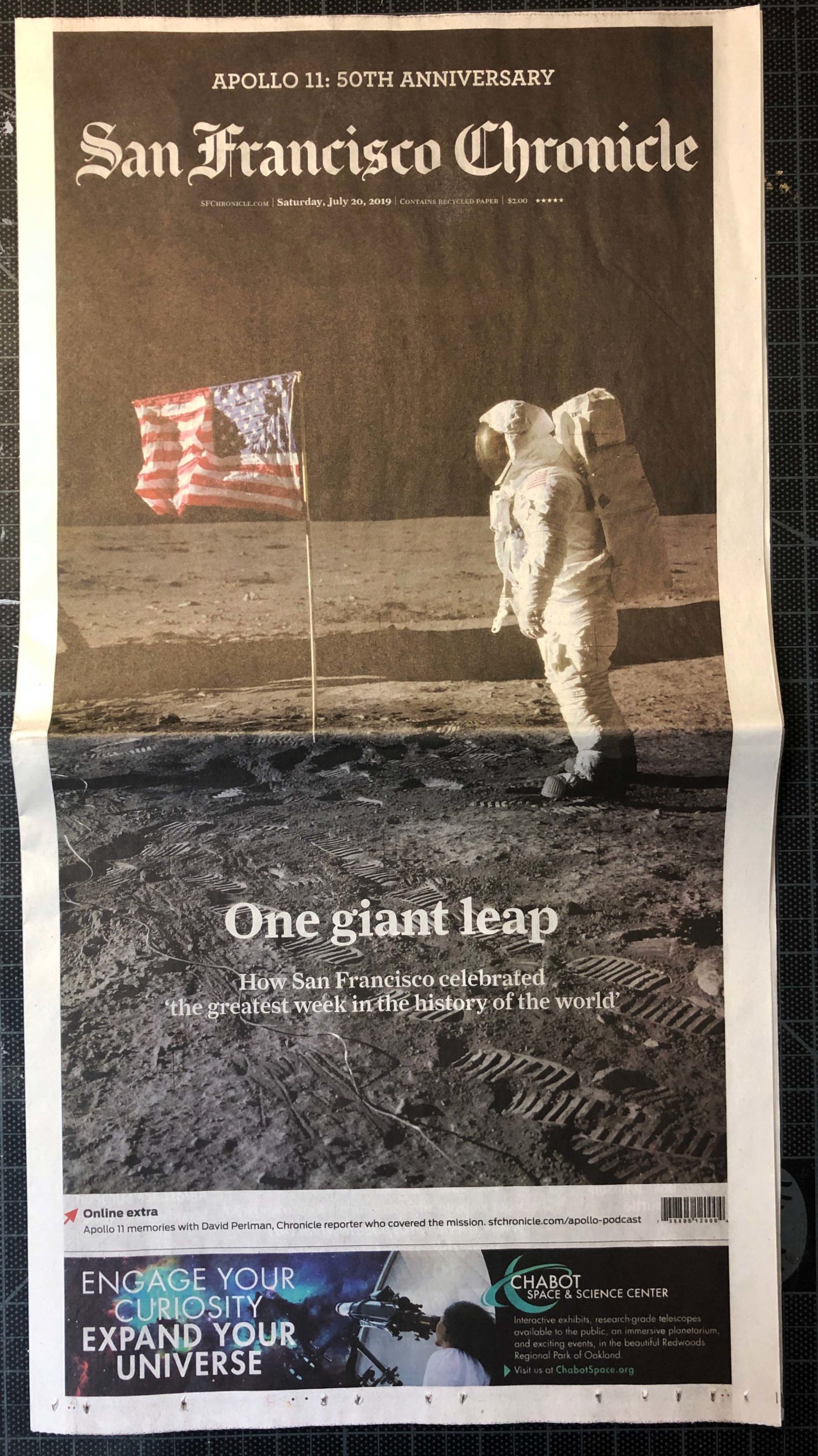
Chabot Ad for Print, San Francisco Chronicle Publication
This is an advertisement for Chabot that appeared as the only ad on the front page of the San Fransisco Chronicle, in a publication which featured the 50th anniversary of Apollo landing on the moon. I staged the photograph in one of Chabot’s telescope domes, came up with the copy—including the tagline, and put it together using Illustrator.
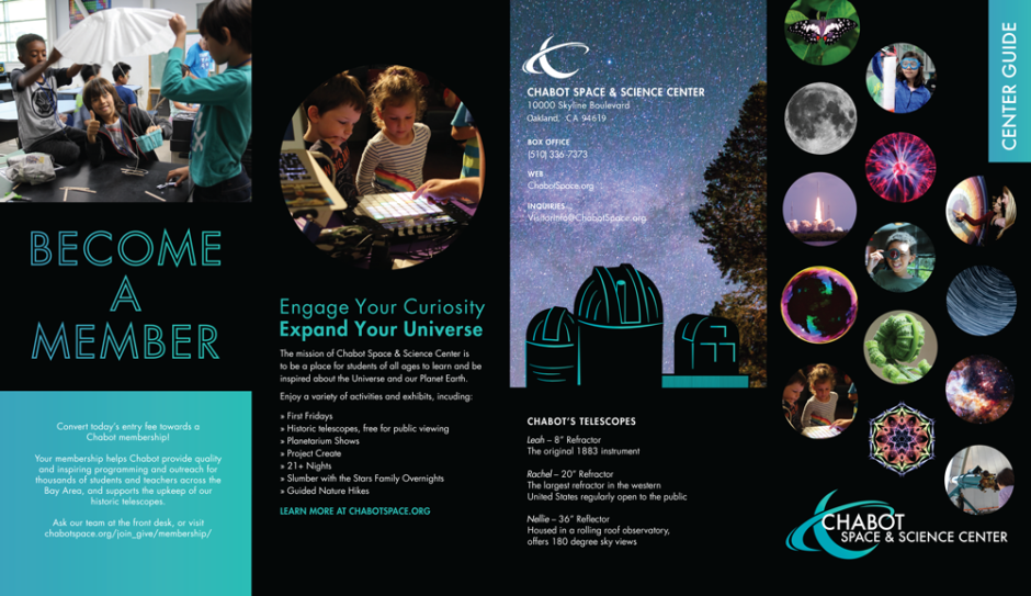
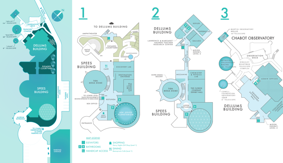
Center Brochures
Chabot has been located in Redwood Regional Park in Oakland since 2000, in a beautiful, spacious 3-level building designed with all of the Center’s needs in mind. This is a 4-fold wayfinding brochure that I created for Chabot, to be handed out at the front desk. Top: Exterior of brochure Bottom: Interior maps. I proposed this project to the marketing team and oversaw production. I then proposed that this concept of science and nature images within circles be applied to exterior banners, lining the drive up to the museum.
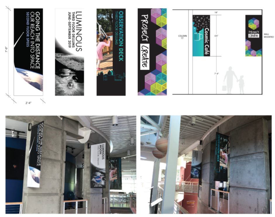
Interior Wayfinding Banners
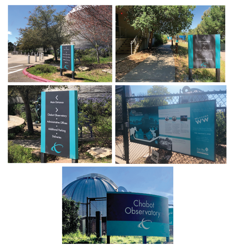
Exterior Wayfinding
Chabot’s campus signage was in dire need of an update, damaged over the years, and no longer on brand. Using Chabot’s new teal “Cha-blue” which I’d established, Futura font, and the Saturn emblem, I created 4 signs across the campus. I designed these signs, and oversaw their fabrication and installation. The largest sign has a slight curve to it, and is positioned just outside the gate to Chabot’s Observatory, along with a framed wayfinding map. The type is a reflective vinyl that is visible in the evening with car headlights and flashlights, for the many visitors who come up to Chabot to use Chabot’s telescopes.
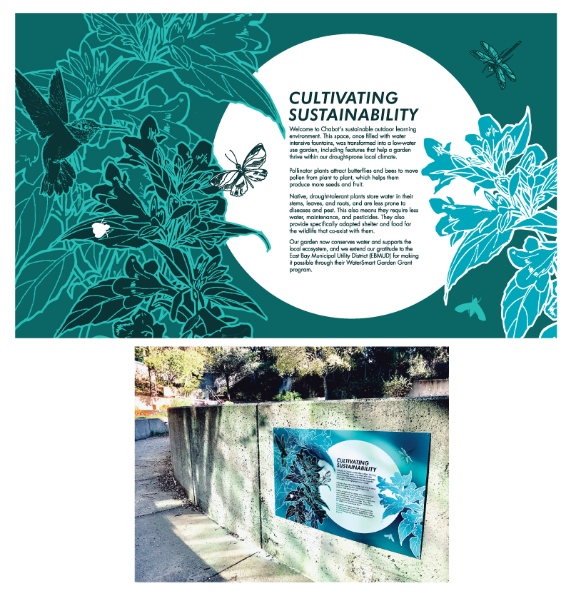
Courtyard Garden Sign, Illustration
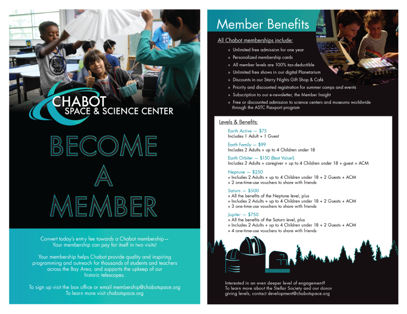
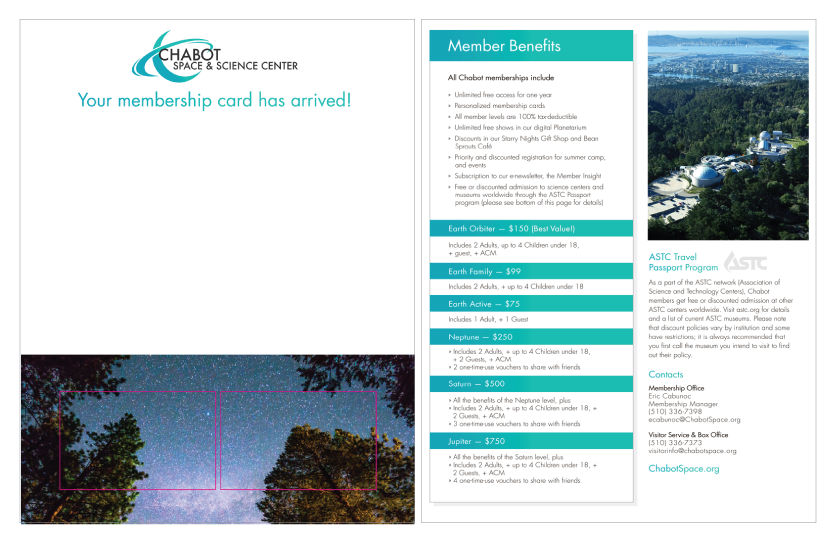
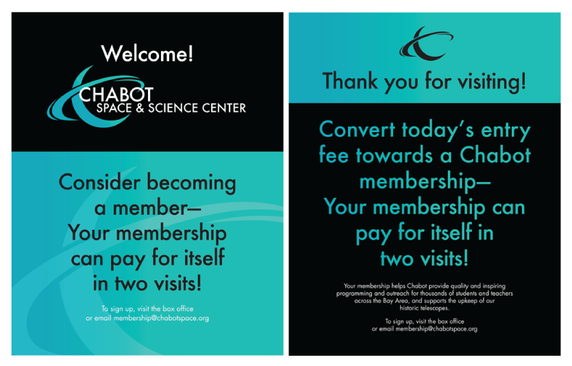
Membership Onboarding Materials
12 comments on “Chabot Space & Science Center”
Comments are closed.